

This is part two of my two-part analysis of Tailwind CSS – link to part one.
Last week's post covered Tailwind CSS's greatest strengths:
- Good off-the-shelf yet configurable design system.
- Increases team velocity by flattening specificity.
- Provides good guardrails for developer/designer handoff.
All tooling decisions have inherent tradeoffs. Use Java over C and you lose fine-grained memory management. Choose Python over Java and you lose compile-time type checking.
While I love Tailwind for prototyping, I do not use it for production codebases. Where maintainability is key and there's time to document and enforce style workflow.
Cost of Abstractions
A popular mental model of Tailwind is as a set of CSS shorthand with corresponding Design System tokens. So you need to know CSS well to use it effectively.
But if you need to know CSS to get the most out of Tailwind, why memorize a new set of class names?
For example, Tailwind's default basis-6 class translated to 1.5rem, but that's about as fun to memorize as the multiplication table. On top of having an open MDN tab, now I need a Tailwind tab too.
Tailwind forces an extra HTML-based abstraction layer for a CSS job. This is always going to be an anti-pattern. On balance, I think it's slightly worse than just using inline CSS – either via Styled Components or "vanilla CSS". At least inline CSS doesn't force me to memorize a bunch of new class names.
If you read the last sentence and thought 'but inline CSS can't handle media queries or pseudo selectors!', you can achieve both via CSS custom properties. Check out this demo:
See the Pen Inline Responsive / Psuedo Selector Demo by Shimin Zhang (@shimin-zhang) on CodePen.
The "Ugly" Class Names Problem
Here's something that the Tailwind documentation and I can both agree on: the long string of Tailwind class names are ugly. Here's a quote directly from the official docs:
Now I know what you’re thinking, “this is an atrocity, what a horrible mess!” and you’re right, it’s kind of ugly.
'Ugly' and 'horrible mess' implies the classes are hard to comprehend. Hard to comprehend things are impossible to maintain. I also want to point out that the sentence does not end with 'but it becomes so much easier to follow once you are used to it!`. It only becomes marginally better with familiarity.
Tailwind does help you create faster by cutting out time spent writing descriptive class names and worrying about specificity. But class names with methodologies like BEM also provide semantic meaning and create (hopefully useful) layers of abstraction.
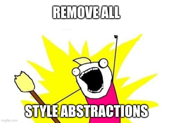
Bad abstractions lead to unmanageable CSS stylesheets, yet the answer need not be 'remove all abstractions'.
Let's take a look at the user experience of a CSS update in 4 scenarios. Let's also pretend we are a new dev trying to double the block direction (y-axis) margin of the green block in viewports > 1536px.
See the Pen Badly Organized CSS by Shimin Zhang (@shimin-zhang) on CodePen.
Our first variation – the stylesheets in the attic corner approach. Here, CSS declarations are set in arbitrary class selectors and it's impossible to know where our new margin should go. It should go in a new .hero block under the large @media block, though the whole thing should be refactored because it hurts to read.
See the Pen Tailwind Example by Shimin Zhang (@shimin-zhang) on CodePen.
Here's the Tailwind variation. It's definitely easier to read, though I still did a lot of scanning to find the my-12 y-axis margin class in order to figure out where to put the new 2xl:mt-24 class.
See the Pen Unorganized CSS by Shimin Zhang (@shimin-zhang) on CodePen.
Our third example: a CSS module-like approach where there are no risks of clashing selectors. We have the same reading pattern as scenario 2. I scan the entire file and find the default top margin value, then double it in the large viewport block.
I find the UX between scenarios 2 and 3 fairly similar, we make a minor tradeoff between file size and developer time (Tailwind is smaller, but we need to keep the tab open to find out my-12 is 3rem in size).
See the Pen Organized CSS by Shimin Zhang (@shimin-zhang) on CodePen.
Our organized CSS scenario, where the class names are abstracted via a simple convention:
container-*classes to handle container-based properties such as padding, width, border-radius.layout-*classes to handle the element's relationship with others, such as margin, align-self, and float.*catchall for everything else.
In this case, we change the margin by changing .layout-centered's style, perhaps splitting it into another layout class that has twice the y-margin for larger viewports.
This is especially useful as our styles grow more complex. Or when you read another developer's code. With Tailwind, you are forever stuck with a linear reading of all class names. With good abstractions, we can chunk and navigate in a fraction of the time.
Messy HTML isn't just aesthetics. It's technical debt that will make your styles harder to read and maintain.
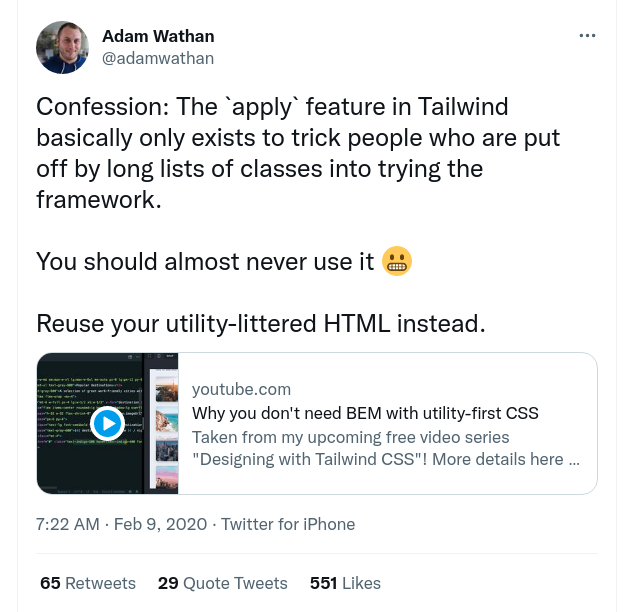
What about using @apply?
Tailwind provides a solution to the 'lack of abstraction' problem, the @apply directive. You can use it to mix existing Tailwind styles and create new class-based abstractions. We can for example create our layout abstraction from the above scenario 4:
.layout-centered {
  @apply my-12 mx-auto;
}
But the `@apply` has two sins:
- It's just regular CSS with another layer of abstraction – already covered above.
- It makes your code even harder to read. Before
@applyyou have a single source of truth. After@apply, style can be coming from a number of classes.
The second problem is especially troublesome, it easily leads to specificity issues – the reason why @apply has a special treatment for !important.
Don't take my word for it, this is what Tailwind's creator says about @apply:
So What's the Point?
I am not writing this post to bash Tailwind CSS. I like most of its features and believe component-based style reuse is the future – at least in a front-end framework context. I also have reservations about using it in a large codebase.
If you are on the fence about Tailwind, I hope my analysis of its strengths and weaknesses can help you make better decisions.
And if you are thinking about creating the next best CSS framework, this post is an additional data point on what Tailwind CSS does well – and how it can be improved.
Big Idea of the Week
This week's big idea comes from Robin William's Non-Designer's Design Book:
If you can put the dynamics of the relationship into words, you have power over it.
The quote is from a chapter about matching font types, though I find it applicable to all areas of craft.
You have to create a taxonomy in order to put general feelings into words. When I learned about film, I stopped saying a movie's 'pretty good'. When I learned how to cook, 'something is missing' became 'it needs more sharpness and body'.
In just this post, we tried to suss out what it means that Tailwind classes are 'messy'. By putting that gut feeling into words, we see that Tailwind forces us to scan the entire class in linear time, leading to maintainability issues. This exercise may help us to create a better, less-messy tool.
Next time you want to get a better understanding of a fuzzy subject, describe it. Put that abstract feeling into concrete words.
Heck, that's probably 80% of the reason why I write this blog :).