Is your project's documentation treated as an afterthought?
Isn't it enough to tell a user that "it's all in the docs, just read it"?
Or maybe you rely on automated documentation tools like JSDoc, "and wham! bam! Thank You Ma'am!" you get it for free!
I'm working on a new documentation site for a design system project at work, which got me thinking about what works and what doesn't for technical doc sites. While I knew I wanted to use Storybook as the backbone of the front-end doc site, I didn't stare at a blank component_readme.mdx for long before I started researching about what makes a frontend doc site great.
Here are the 4 tips that emerged during my research for better Front End documentation, some of these rules are elements of a good design, while others are FE specific and do not generalize well. They are especially helpful for those who are not working closely with UX/UI designers.
Understand the Jobs to be Done
People don't want to buy a quarter-inch drill. They want a quarter-inch hole!
Harvard Business School professor Theodore Levitt's quote perfectly sums up Jobs Theory, a marketing theory that postulates all products and services are consumed because of basic needs. While the theory is academic, it applies equally well to your doc sites.
Users do not visit a doc site because they want to hear the in and outs of your refactoring practices or how much thought you've put into your framework/component design, they hire your doc site to get a job done. Think of this as a simplified version of the more in-depth user-centered design process. Here are some common jobs that your documentation is asked to do:
- Help a new user get started.
- List a component's functionalities and what can / cannot be achieved.
- How to achieve a specific task ASAP, preferably with copy / pastable code.
- Quickly see examples of usage patterns for inspiration.
- Troubleshooting a bug and Google is no help.
Teach of these can be thought of like an "I want to..." request. A quick look at the React Doc site's installation navigation:
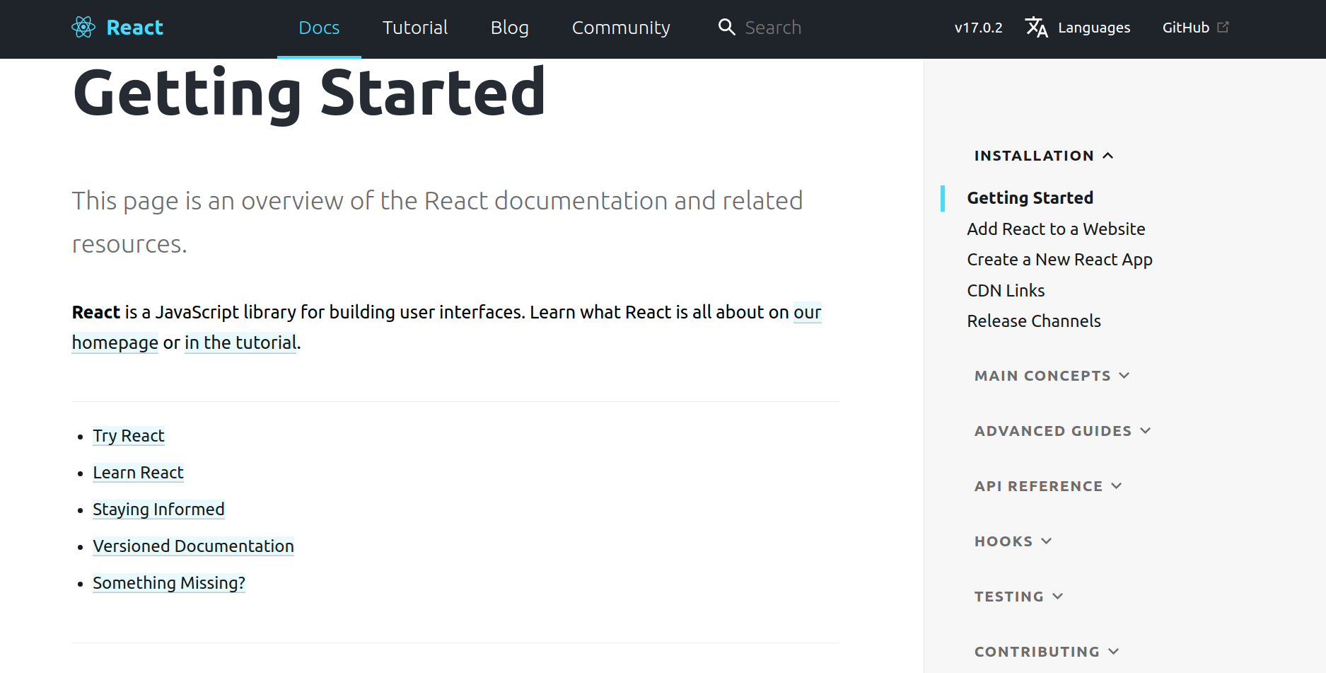
Under the Installation header, we have 4 pages each with a very specific job to be done:
- I want to install React on an existing site.
- I want to set up a new React App.
- I want to use React without NPM
- I'm maintaining React tooling and need to know how versioning works.
However, this pattern falls apart when it comes to the Advanced guides / API References / Hooks portions, which of them should I click on to find out how to configure a `useEffect` hook to only fire a single time on component load?
The jobs to be done theory provides us with more addendums on what good documentation should have:
- A search bar so users can search for keywords related to their jobs to be done (It's a toolbox, not a novel).
- A lack of marketing material interspersed in your doc site, keep marketing to marketing areas of the site for people whose jobs to be done is finding out if they want to use your software.
- Keep the site accessible, not just accessible for those with visual or motor impairments, but for the impatient developer whose been fighting with a bug for the last half an hour and really can't deal with an illogical tab sequence right this moment...
Tip 1 For Better FE Documentation: Understand the user's job to be done when reaching for your doc site and remove unnecessary content.
The Life-Changing Magic of Categorizing Your Doc Site
Our list of jobs to be done is a good starting point for us to start organizing our data. We've already seen an example of how data is organized in React's main doc site nav bar, but this also applies to individual feature/component pages.
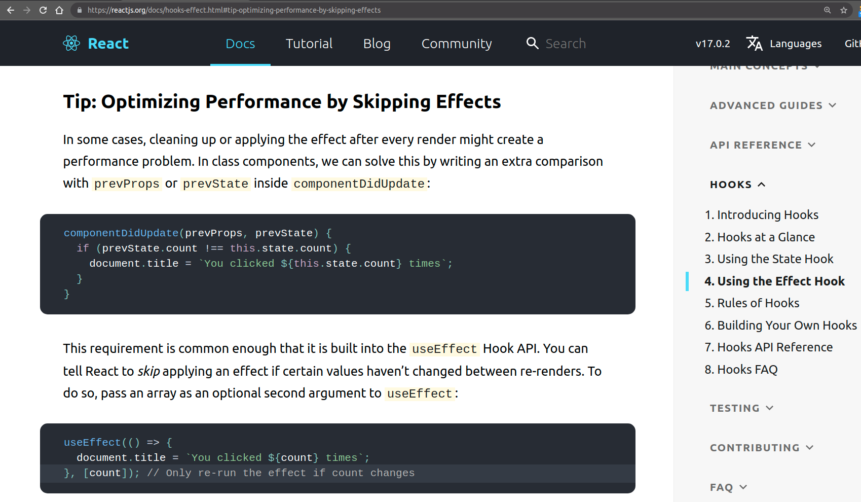
Going back to the previous example where I wanted a useEffect hook in React to only fire once, and I have determined that the Hooks -> Using the Effect Hook page has the answer (maybe because this is where I looked for the last time I had this question). I still have to scroll quite far down to Tip: Optimizing Performance by Skipping Effects section to have my question answered.
This can be avoided by organizing the Effect hook's data more effectively. Instead of burying this particularly common use-case inside a section that starts with the word 'Tip', pulls the information out into its own section with the title Skipping Effects or Effect Triggers, and adding on-page navigation with section titles would vastly improve my particular use case.
Marie Kondo, the author of The Life Changing Magic of Tidying Up, is best known for throwing away all of her clients' possessions that do not 'spark joy'. Perhaps less well known, her definition of a tidied up room is one in which every item serves a purpose and has a place where it belongs. In a sense, isn't that the same thing that a thoughtful piece of documentation strives to do? Where every piece of information does a specific job for the user and belongs in the right place.
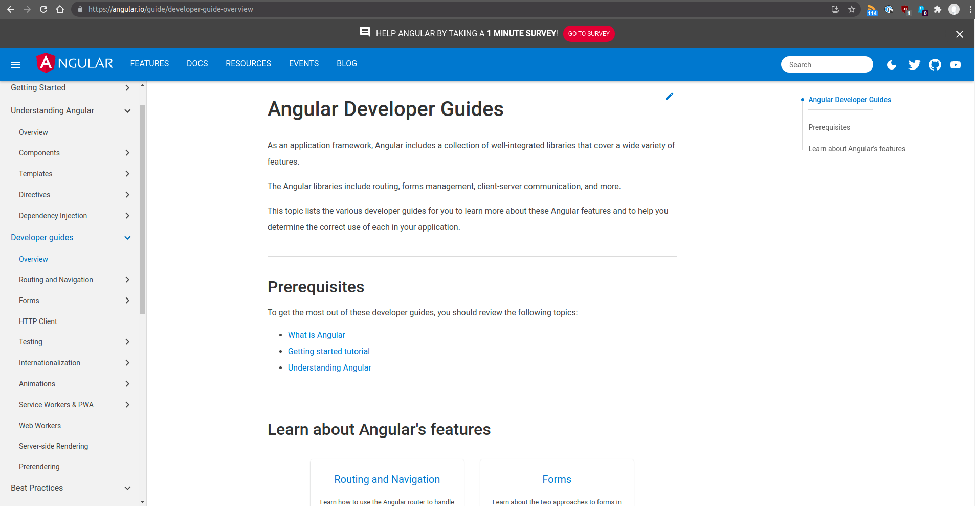
To push the toolbox analogy further, what happens if the screwdrivers are organized by size and type but the user doesn't know the difference between Philips and Star? One approach is to have a 'Beginner's Guide' section that exclusively caters to the beginners and provides sufficient knowledge needed to use the rest of the site. Another approach, taken by Angular Docs, is to provide a section-by-section overview with explicit prerequisite links or just enough overview so users can navigate the rest of the section.
'What about information that does not technically belong to a broader category?' I hear you ask. Luckily, there's a really good industry-standard way to group all your miscellaneous tidbits too small to deserve their own category but also too important to bury into other sections. The always helpful Frequently Asked Questions (FAQ) section is particularly useful for sharing tips that may not belong elsewhere. FAQs also serve a secondary role, they are question-based navigations that allows deep linking to other parts of your site and can especially be helpful for beginners with insufficient data to navigate otherwise.
Tip 2 For Better FE Documentation: Categorize your documentation sections based on the user's jobs to be done and include a search functionality.
Steal from what works
Software documentation, especially front-end software doc sites, has only been around since the mid-to-late 90s. But software documentation is only a subset of user manuals for tools, and it behooves us to examine what makes a general user manual effective.
Let's compare some of the more popular front-end framework documentations with the user manual of a 2019 Subaru Legacy sedan. Note that while docs sets and paper manuals are functionally very different, their ultimate both help users use a very complex piece of technology. Here are some of my stray observations:
- The Subaru manual starts with a table of common abbreviations and symbols and ends with an index of terms. While one can argue that a search bar is a replacement for both, it can be helpful to include a glossary page with all important key concepts/words in the same place. React and Angular both have glossary pages.
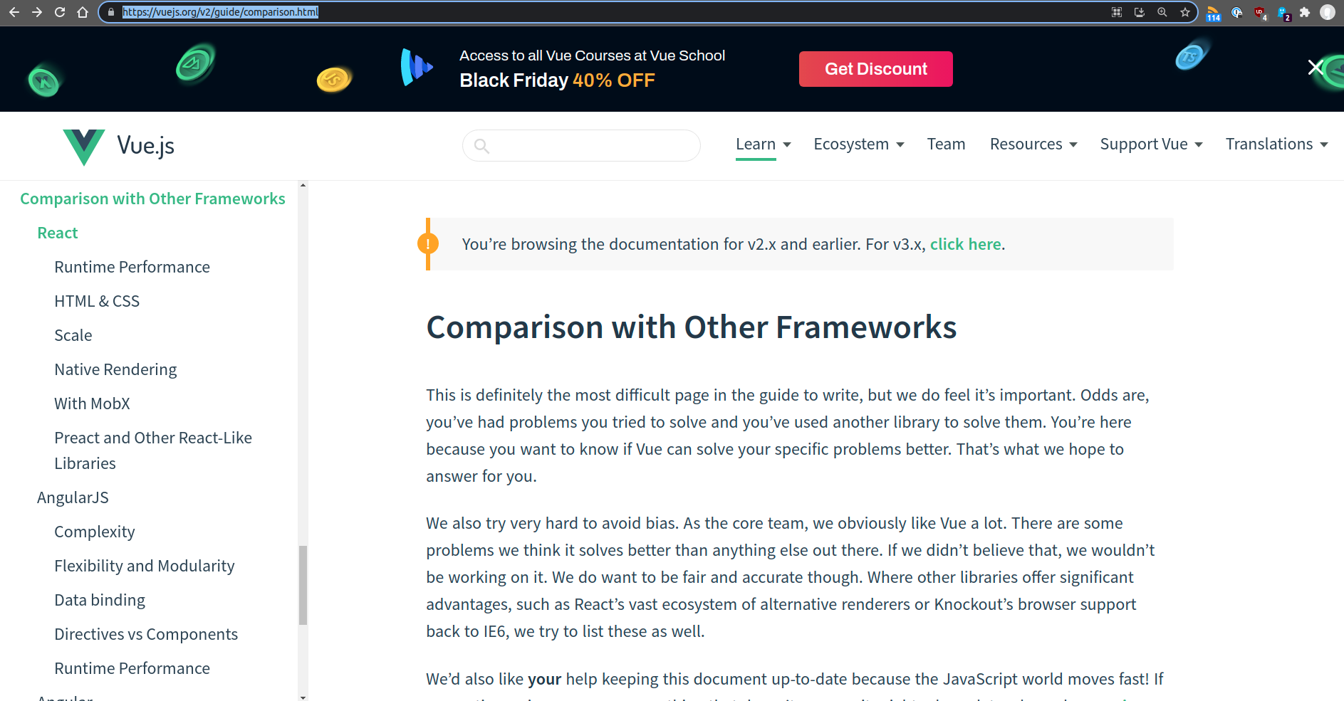
- The section of the Subaru user manual is a section on Consumer Information and Reporting safety defects with information on how to report safety defects to the NHTSA. Out of the three major frameworks I considered (Vue, Angular, React), only react had a dedicated page on how to file bugs as part of its contributions page.
- One interesting concept I came across while researching user manual best practices is the idea to enhance findability via logically ordering content by chronological, frequency, or expertise level. One common application of this is to have 'beginner', 'normal', and 'advanced' sections that categories users via their expertise level. A great example of enhanced findability is the usage of cheatsheets, a great example of this is the 'Gas Station Reference' page that's the last page of the Subaru manual that's both handy and very easy to find. The only doc site equivalent I found is Angular's quick reference, although it is buried deep under 'Reference -> Angular Style and Usage -> Quick Reference' and not nearly as findable as the last page of the manual.
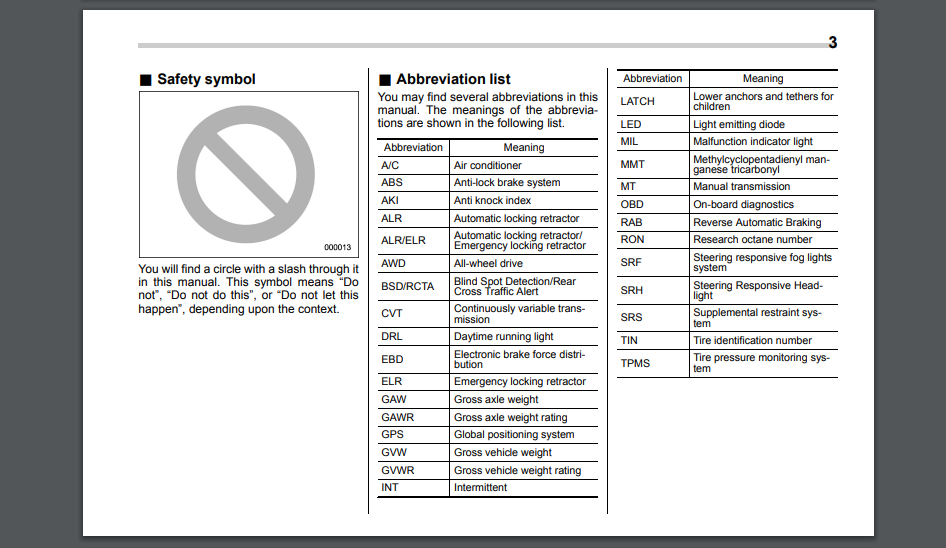
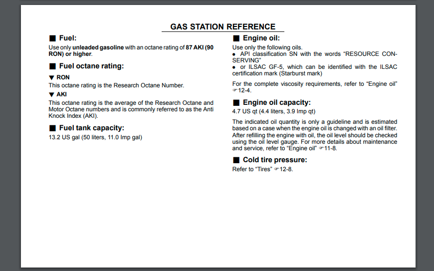
Tip 3 For Better FE Documentation: Enhance your doc site's findability by including cheat sheets, glossaries, troubleshooting guides, and other paper-based manual conventions.
Be Aware of Pitfalls
No discussion of manuals is complete without at least one reference to the infamous IKEA assembly instructions. If IKEA designers can teach a college freshman how to put together a bunk bed without using words, they can definitely teach me how to write idiomatic Javascript. Take a look at the assembly manual below:
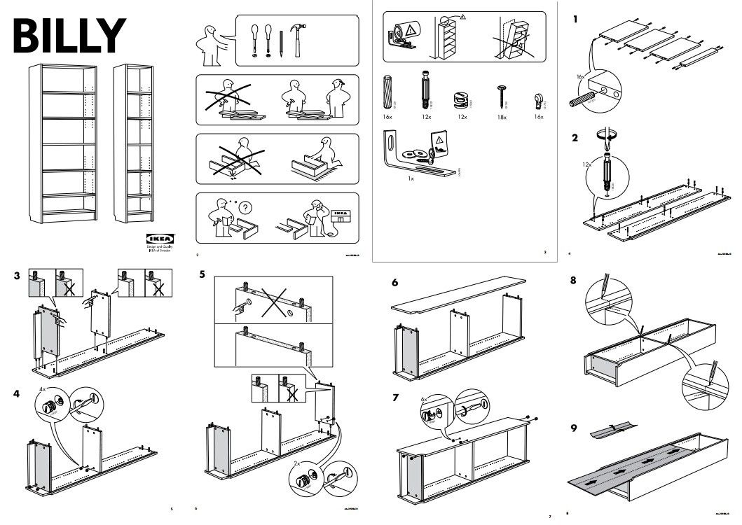
The visual language of furniture in the process of being assembled is much more powerful than if the manual had said for step 1: 'Attach included wooden dowel joints to each side of the plywood dividers boards'. Luckily for us in the front-end web development world, our examples often can take at least 3 different modes, in text form (traditional paragraphs), in code blocks, and via images/screenshots. If you are lucky enough to be working on themes or web UI components, you can even include embedded working demo examples! Use the mode most appropriate for the situation, and it never hurts to include more than one.
Notice also the use of magnified section to bring users attention to key areas of the process, which technically repeats the same graphic but brings both emphasis and aids comprehension. In software documentation, we can achieve a similar result by highlighting attributes/sections of code that change as a result of user input.
Another thing I love about IKEA manuals is the visual emphasis put on pitfalls and potential areas of confusion via counterexamples. Here's an instance of such a common pitfall in the React doc site, see if you can spot it:
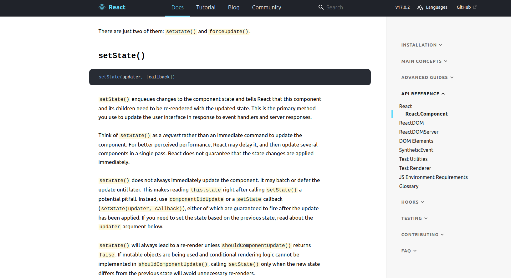
This concept translates easily over to the software world, one thing I particularly love when it comes to usage example is to show a series of 'incorrect', 'better', 'best' examples that progressively captures concepts that can otherwise be hard to capture succinctly.
Tip 4 For Better FE Documentation: Repeat key concepts in different modes and examples with various degrees of correctness to enhance comprehension.
And there you have it! 4 tips that emerged from the research into what makes a documentation site useful and digestible. This is one of those topics where the more you learn, the more you realize there is to learn. UI Design, user experience design, instructional design, and technical writing are just some of the fields that teach us what a 'great' doc site looks and feels like. So whether you are building your own from scratch or using an existing framework such as Vue Press or Storybook, use these tips to take it to the next level.
If you find these tips helpful, you may also enjoy learning about the 5 degrees of code DRYness or how to use code review comments to speed up software delivery.
Happy Coding!
